Feast Your Eyes on Ross Crawford's Cover Design: Observer Food Monthly
10 March 2023
This March we celebrated Ross Crawford’s cover design for one of the worlds leading culinary magazines, The Observer Food Monthly. You might recognise Ross as being the creative mastermind behind Ahoy There, straddling through the visual disciplines of illustration, graphic design and typography. Now, his quintessentially radiant and lavish lettering gets a glutenous remodelling in print.
You straddle the visual disciplines of illustration, graphic design and lettering which is overtly seen in your cover design for Food Monthly, The Observer. Can you tell us about this collaboration, touching on the brief?
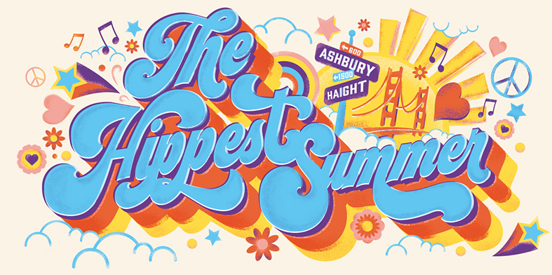
The brief was to bring to life typography and illustration in a fun and relevant way to celebrate The Observer Food Monthly special edition 30. The magazine has a particular aesthetic in composition and illustration styling, so this project was the perfect opportunity to work in my style of merging these disciplines to create an engaging cover. The style direction and theme was open and we leaned in on my concept of creating something crafted, akin to the charm of typography and sign writing from traditional boozers, but with a modern twist. Working with a simple two-tone colourway was a perfect pairing to represent the cover star and its theme.
.jpg)
Creating balance and not making a design too busy is a challenge when it comes to delivering multiple type assets on a single execution. How do you make sure that your design hits that balance?
And that’s exactly what it’s all about. Balance! In this instance it’s providing a standout for the headlines, a focus on the cover lines and a sense of belonging to the feature lines and illustrations, with everything 'hopefully' working in unity. If done right you’ll have the hierarchy balanced which should reflect in the readability.
It’s not just about scaling either, it’s considered typography in its styling and form, how a longer text is balanced sitting next to shorter text. For example, I will tend to focus illustration or framing around it to give it more weight, adding more texture or flourish.
The main challenge of this balancing act was to incorporate the feature image of Clement (cover star), consciously and not obstructing too much of the photo but at the same time making it feel considered. It’s really just a case of stepping back from your work often to review and take it in, you can easily get lost in the process of creating and forget the intended purpose of the piece.

What is it about lettering that you are passionate about?
Lettering and typography have inherently been part of my work since I can remember. Maybe unconsciously so (to a degree) back then, but I’ve always found the inclusion of illustrated type brings such context and power to illustration. Styled lettering can provide a charm and energy which instantly connects a theme or occasion, but sometimes it’s just the simplicity in the artistic form and its message that inspires me.
I’ve been lucky enough to work on a large variety of commissions over the years that cover a wide use of typography and styles so I know the endless possibilities and diverse nature that illustrated type can bring to a project and what it portrays. I look forward to the exploration that every new job brings. Here's to the next!

Explore Ross' portfolio now...


News


