My Name Is Wendy get WIRED
20 November 2024
Fresh from a major collaboration with WIRED Magazine in the both the UK and USA, Carole and Eugénie of French creative studio My Name Is Wendy talk us through their processes in this eye-popping case study.
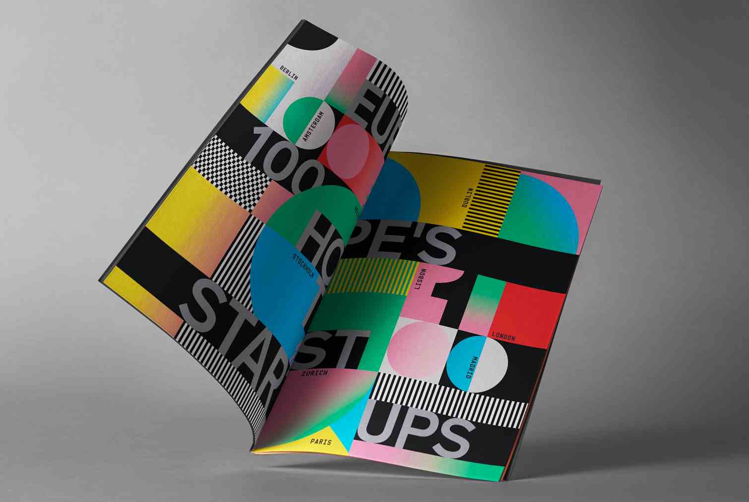
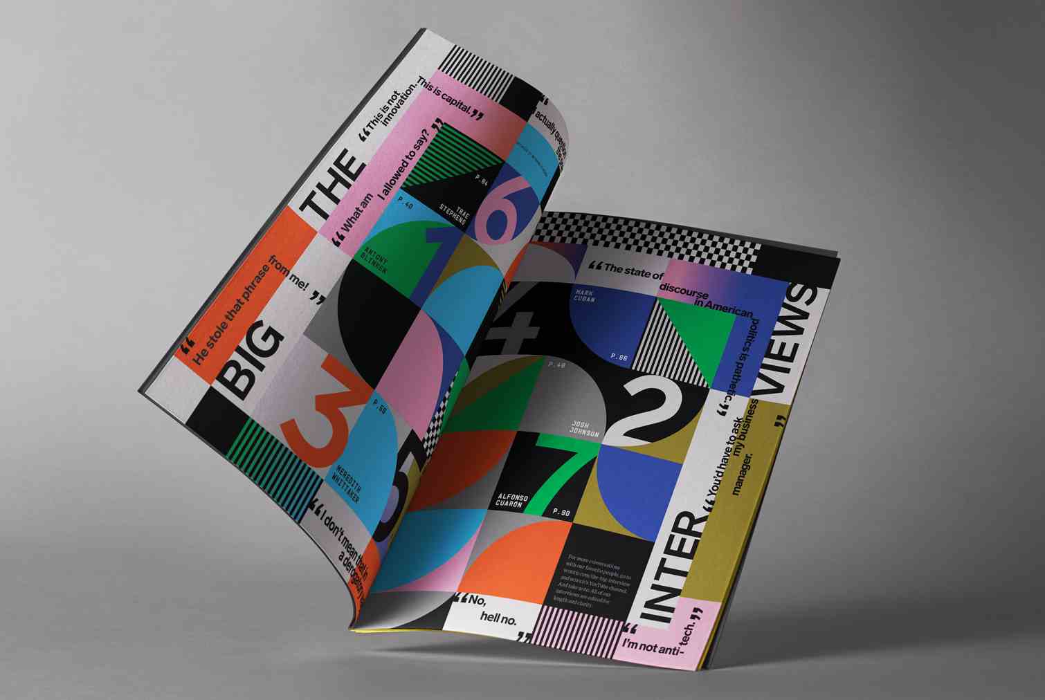
You definitely know when you’ve encountered work by My Name Is Wendy, it’s visual hit isn't something you easily forget! So when WIRED wanted to make a technicolour splash for their UK and US editions, in each case covering a different special feature, they knew where to go for inspiration.
Here, the joint creative forces that make up MNIW, Carole Gautier and Eugénie Favre, walk us through their approach to each of these stunning projects.
WIRED UK
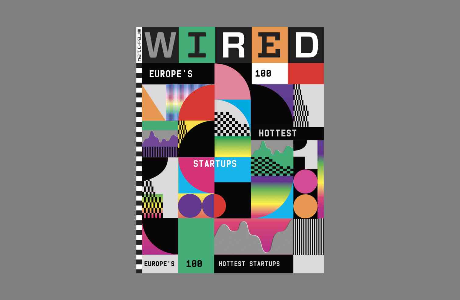
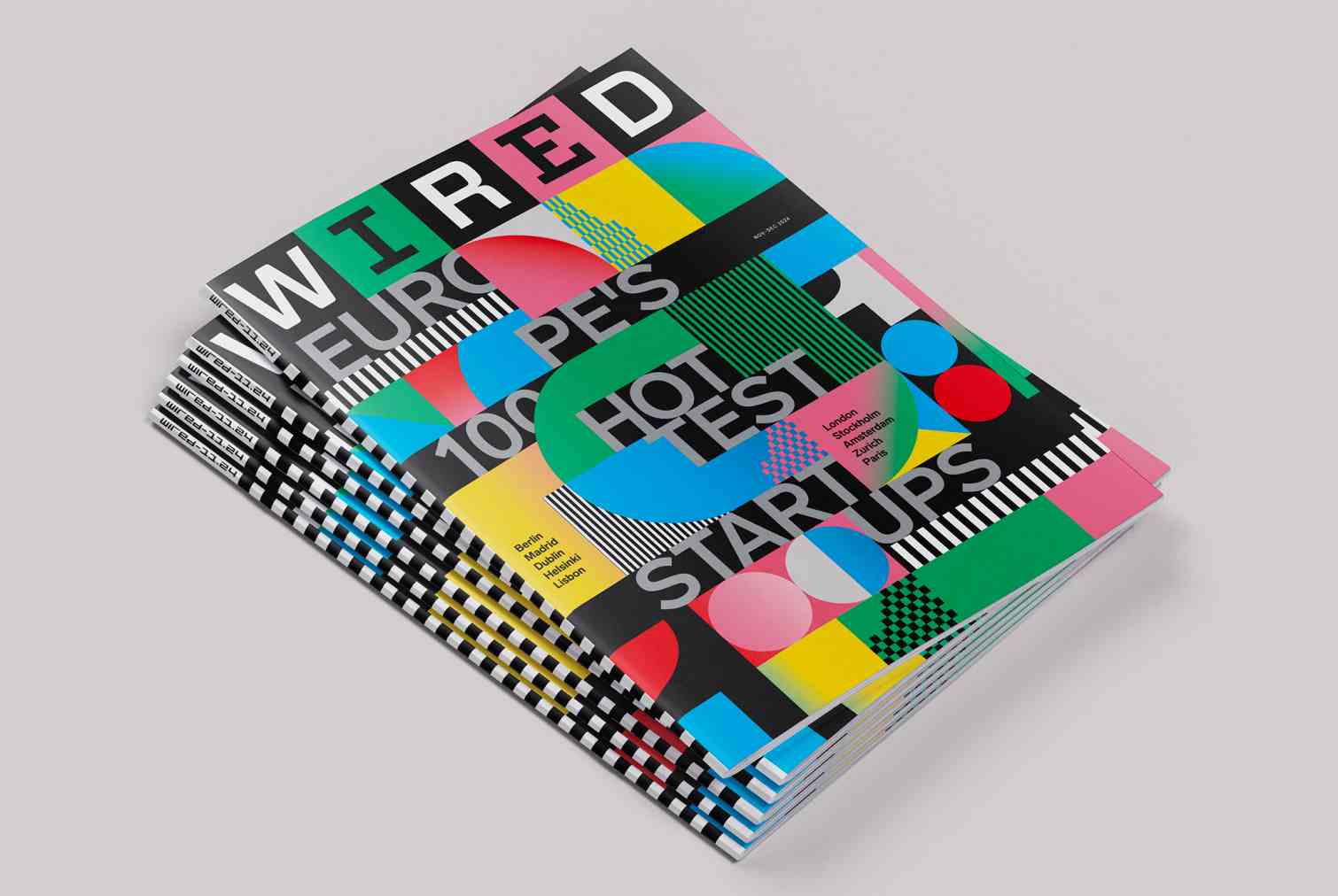
The UK cover feature, ‘Europe's Hottest 100 startups’ featured Europe's most promising young companies. The brief sent by the London team called for highly typographic visuals, with patterns and wave shapes hiding and revealing the letters. The team wanted the title to be the star of the show and to be constructed in a highly sophisticated visual way.
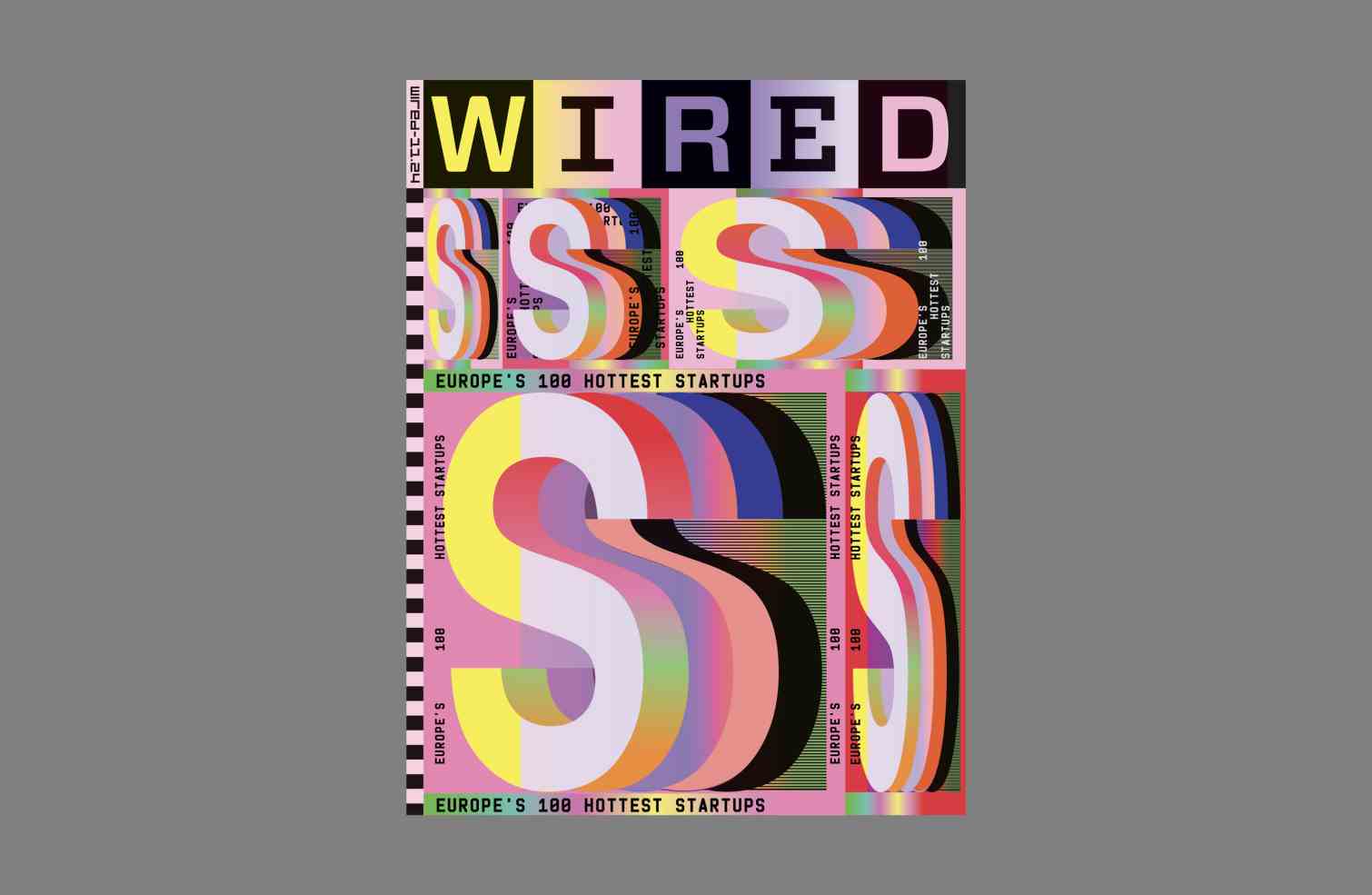
MNIW offered several approaches to the cover during the development phase. These included interpretations of the letter S for Startups, distorted and scaled to suggest dynamism and growth, then an alternative approach exploring carrier waves as a graphic device to symbolise upward flow.
Other concepts played with abstracted geometric patterns creating digital numerical landscapes, paying tribute to the number 100 to reflect the feature title and other experiments including an architectural typographic treatment to represent structure, growth and gigantism.
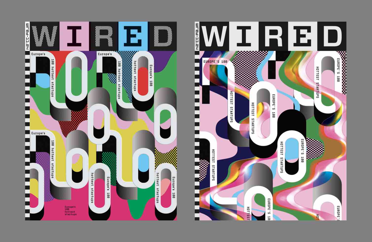
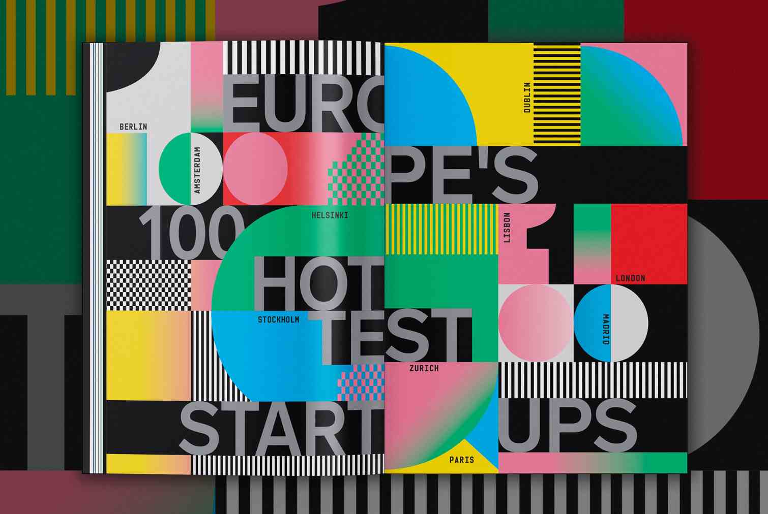
The cover art was also accompanied by an opener inside the magazine.
WIRED USA
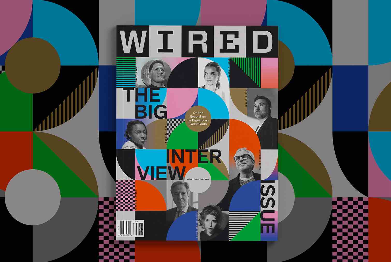
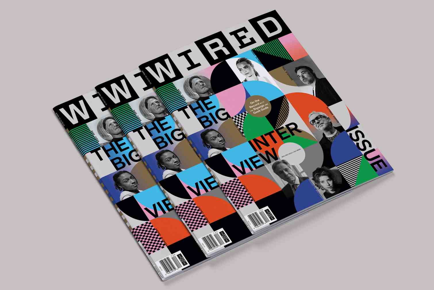
‘The Big Interview Issue’. The cover concept was all about the big B! There were two main constraints: it was necessary to integrate a little orange color in order to recall their previous Big Interview issue and secondly to find a formal way to skillfully and effectively integrate the 7 photographs of the interviewees.
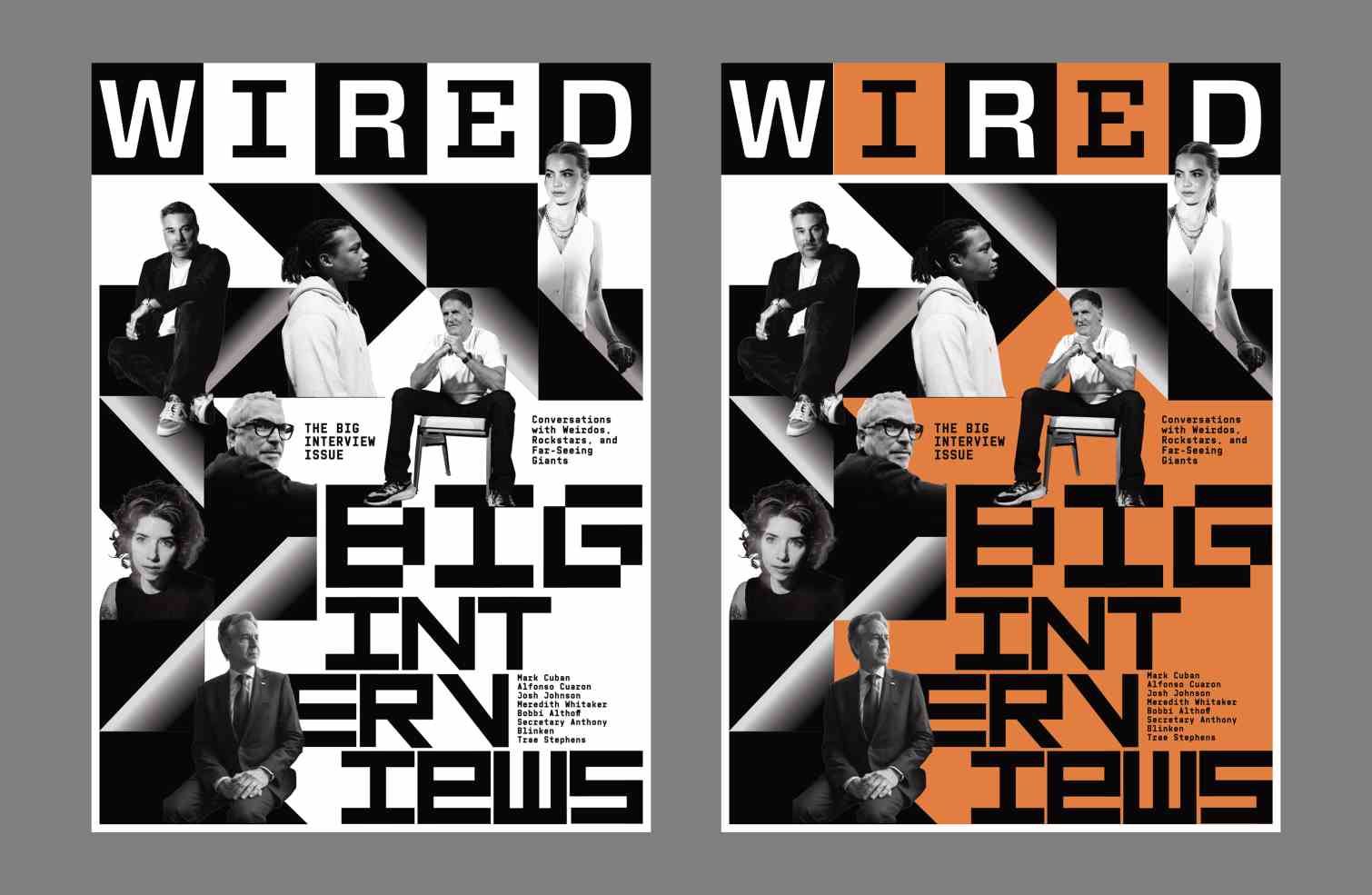
"We designed the visual in the form of facets which seem to tilt to reveal each personality. The US team suggested that we choose a Pantone and we selected a golden metal in order to bring a touch of elegance and refinement to the very colorful and contemporary visual.”
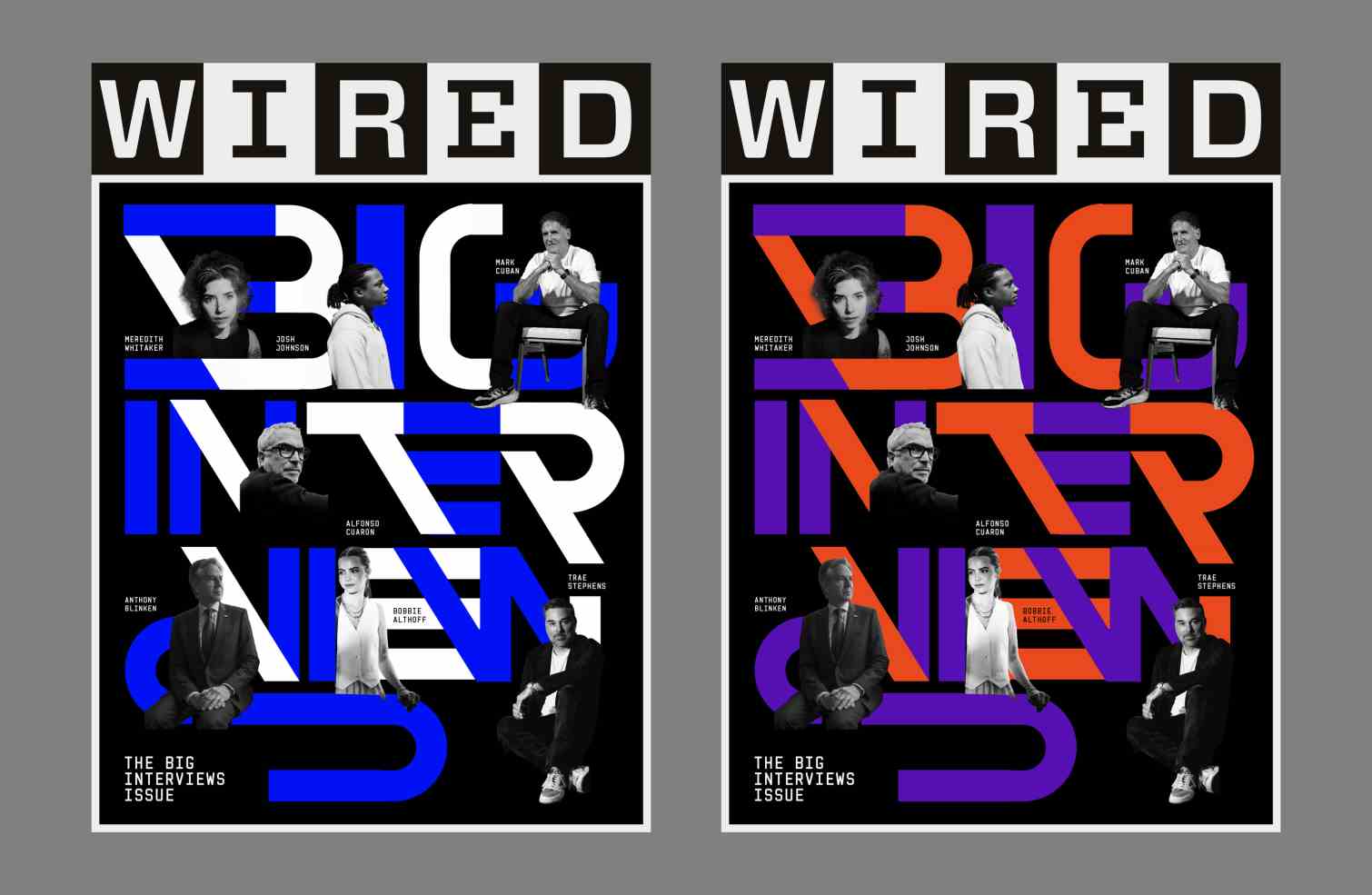
Once again, MNIW initially explored a variety of approaches including a faceted composition championing an abstracted B in a resonating, echoing arrangement. Another concept focussed on creating a scene integrating the interviewees with dynamic lettering: "The way the portraits are cut creates a scenography through body movements and the dialogue of glances”
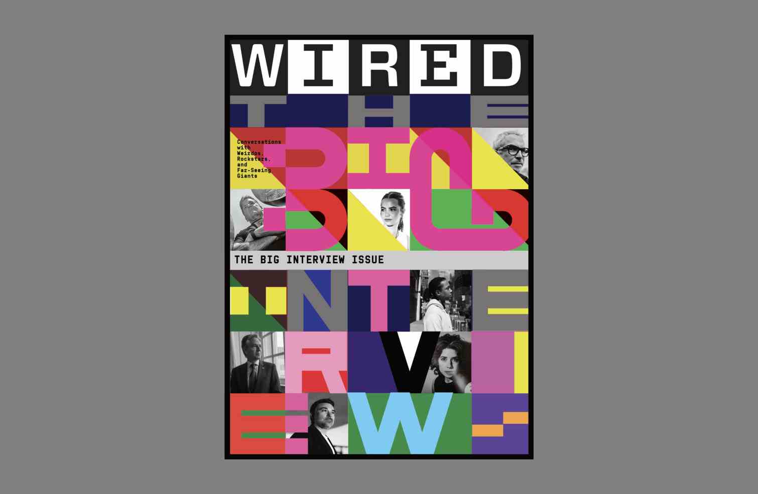
Other directions playedwith highly coloured grids inspired by the WIRED logotype, and a monochromatic brutalist cinema poster: "This specific graphic direction was motivated by the fact that the Wired team had planned to design the double pages of their magazine as posters to be read vertically, in order to bring a cinematographic and iconic feel.”
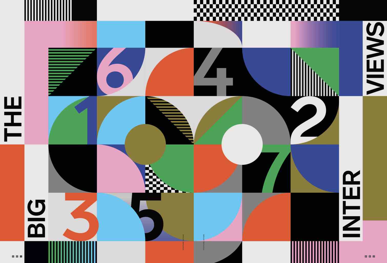
Once again, an opener was created for inside the US issue.
To view more of MNIW’s startling work, click here...


News


