It's a Wrap!
27 November 2021
It’s been an adrenal Autumn so far at CIA! New additions to the agency team, a zesty looking Motion site makeover and some dynamite new signings. Business is brisk and one commissioning sector that seems to boast complete viral immunity is packaging design. We saw it increase majorly last Spring when online shopping became a therapeutic must — the thrill of hitting “buy-now” only rivalled by the delight of the resulting visitor to the door — albeit masked, throwing a product at us and running back to their van like an anti-burglar — and it hasn’t let up since.
Here’s some CIA packaging p**n, tear it open. You’re welcome.
First up on our list has to be Charlotte Day’s botanical illustrations for Diageo’s ‘Rare by Nature’ Special Releases Whisky Collection.
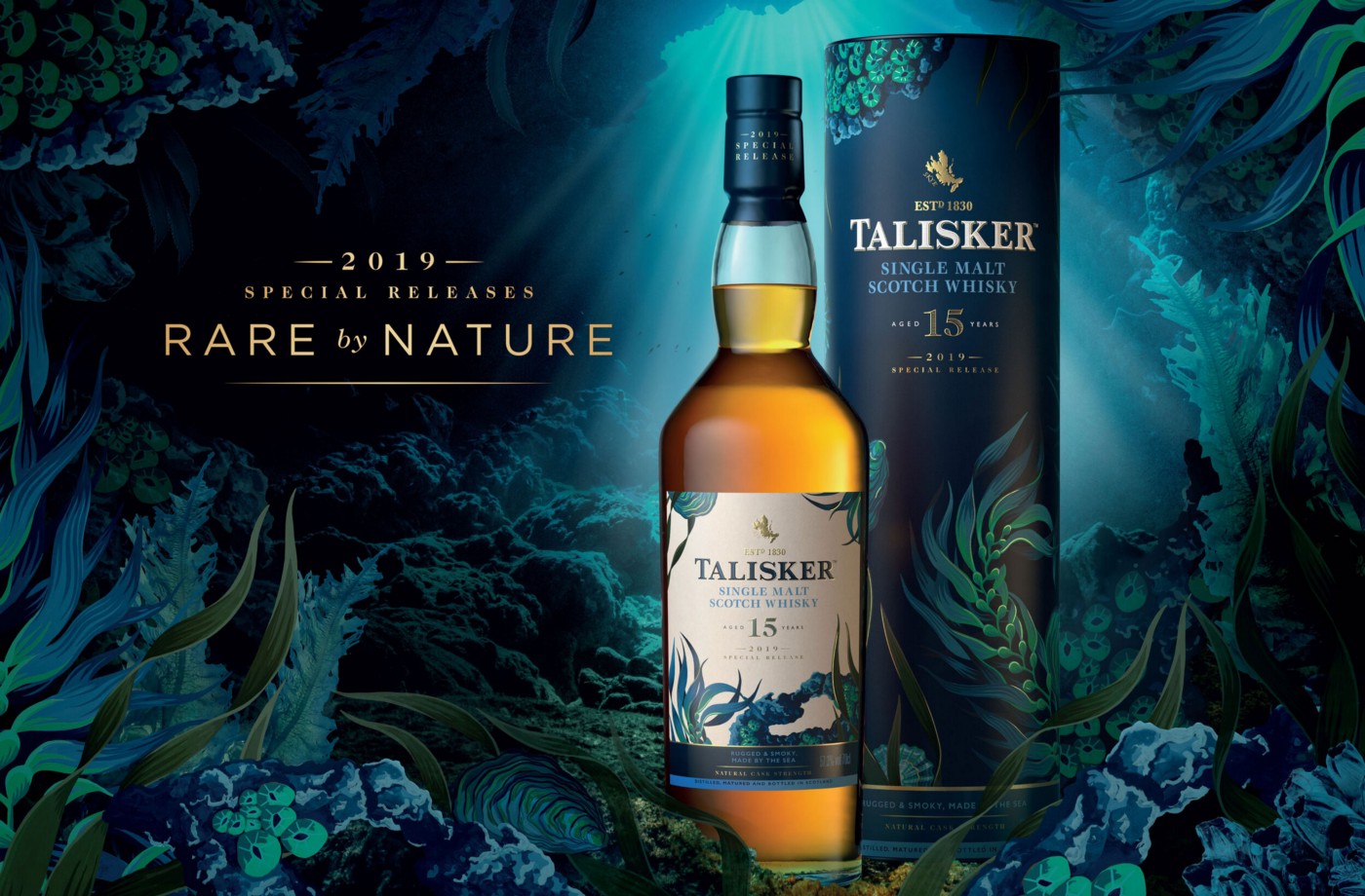
The illustrative detailing and colour palette of each design was carefully chosen to reflect both the unique flora and fauna surrounding each distillery, the taste profiles and characters. This trio of Whisky delights results in a bold, impactful, and luxurious design that pays homage to Diageo’s botanical brand story!
We caught up with Charlotte to hear more on her involvement in this special project.
“Botanical illustrations are at the heart of my creative practice and this project was definitely a good fit for my experience. It was also another opportunity to work with Diageo who, as such a well-respected group in the drinks industry, were keen to invest in creating premium quality marketing campaigns. It also didn’t hurt that Whisky is my tipple of choice so it’s definitely easier to get excited about a project when you enjoy the product!”
With a level of craftsmanship and detail rarely seen in contemporary illustration, but still retaining that modern edge, Charlotte has produced work for a multitude of luxury packaging clients.
We wanted to know from Charlotte what makes illustrated packaging a strong tool for communication?
As well as more representative illustrations that depict key ingredients or flavour profiles, it is also possible to tell a story that reveals something of the nature of a product. In the case of ‘Rare by Nature’, the illustrations speak to the environment and local wildlife of the different distilleries.
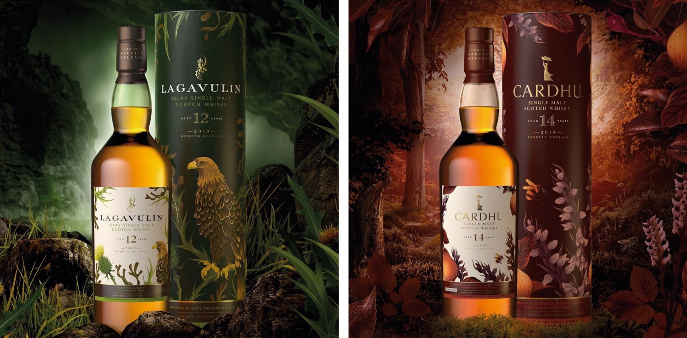
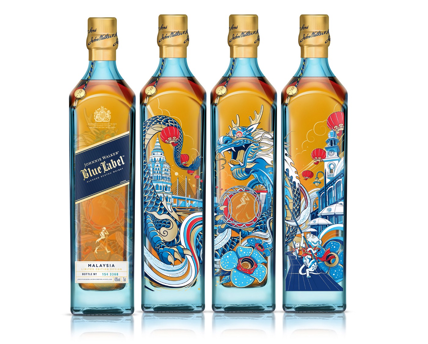
We also saw Johnnie Walker Blue Label get a spectacular Penang re-design. Illustrated by artist Shan Jiang, the square bottle features three continuous facets of iconic Penang elements alongside the bottle’s label. The London-based illustrator has incorporated the Kek Lok Si Temple — Malaysia’s largest Buddhist temple — its red lanterns, and a dragon dance. This enticing illustration is sure worth it’s place on our list!
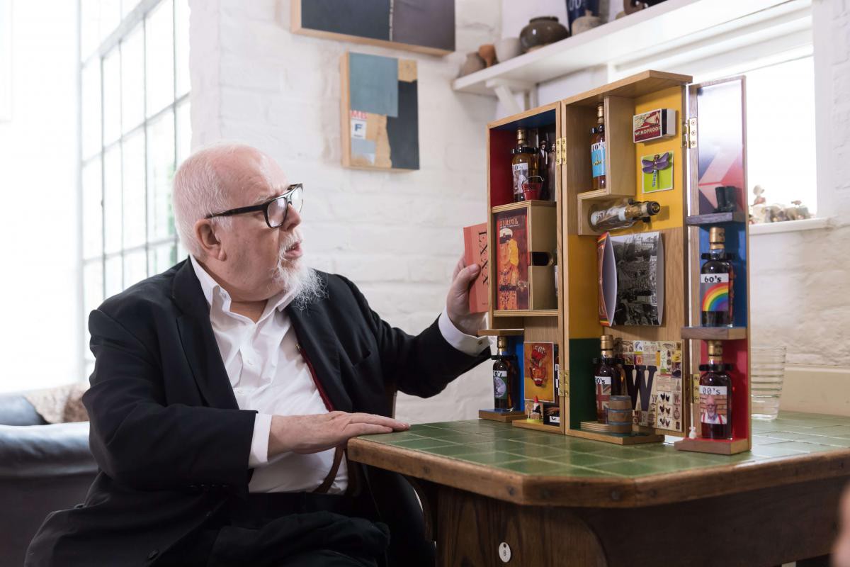
To mark Sir Peter Blake’s 80th birthday, Macallan invested in a truly stand-out packaging design — a limited-edition treasure trove of colour and stories, containing eight whisky miniatures, each with a label reflecting a particular decade of Sir Peter Blake’s life.
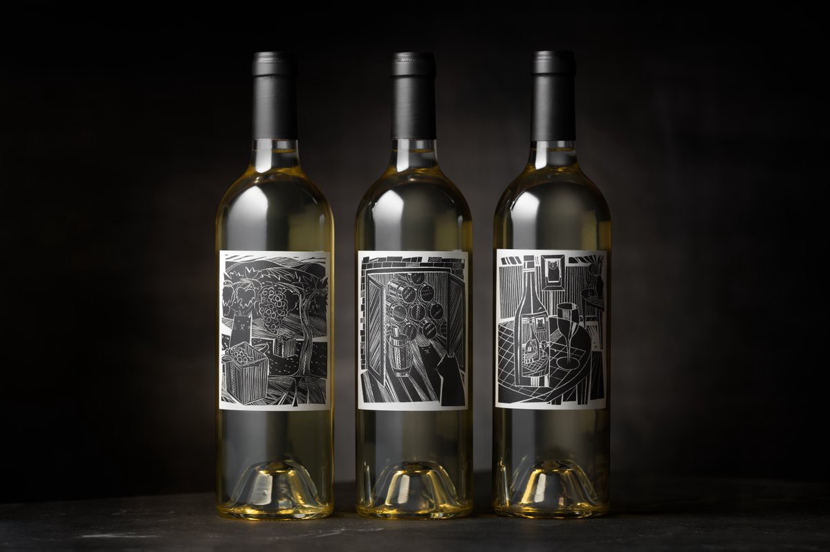
From whisky to wine: finally we have Jonny Gibbs who is serving some serious elegance with his latest labels for The Fluent Wine Company.
Handcrafted with care, Jonny Gibb’s distinctive engraved style matches perfectly with the sustainable ethos and sheer beauty of this Californian based brand.
“Emblems, symbols, illustrations and logotypes, all of these play their part, as well as the ubiquitous bar-code: essential elements of the brand. Fluent Wines is an example of a book illustration, I suggest, as a story which happens to appear on a wine label.”
“The wine name originates from Bungle, the Glass Cat who features in L. Frank Baum’s Wizard of Oz. I was asked to place a cat discretely in each illustration. The brief was to be interpreted freely, my version of a cat. I was given various references for wine production, storage, and the Napa Valley landscape. As such these were secondary sources, partly because of lockdown. Also, I have never been to the USA. Much of my drawing & painting in the studio has been about landscape, interior and still life as well as pure abstraction. All my illustrations are made as wood engravings.”
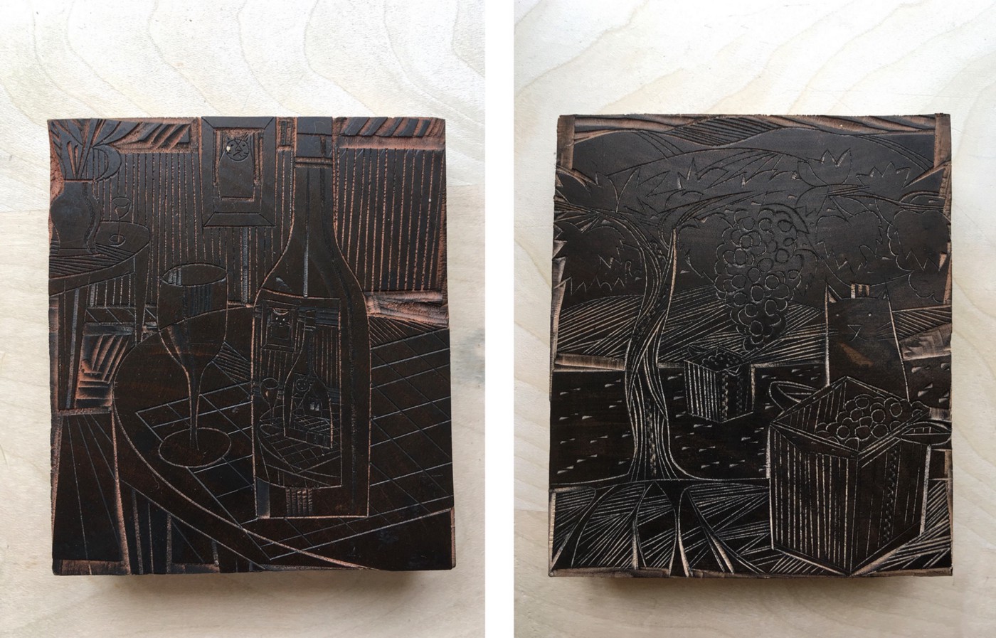
With over 40 years of experience in the illustration industry, we asked Jonny what are the 3 most important things to consider when creating a packaging design?
Look at the best examples of the genre, current and historical modes from trash to high art. I suggest that you must remember that you have been commissioned because the art editor likes your work. This sounds simple, obvious but is not necessarily so. Sometimes one is tempted to try to be someone else. One needs to be confident in what one truly admires. Cultivate this to a serious level and make time for it. Deeper knowledge guides and inspires the work.
That’s a wrap!
If you’ve got a packaging project on the boil and need some inspiration be sure to check out our website or get started now by dropping us an email at info@centralillustration.com


News


