Artist Interview with Alice Pattullo
10 October 2022
1. How would you describe your style in 3 words?
Decorative, nostalgic, chaotic.
2. What has been your favourite project to date and why?
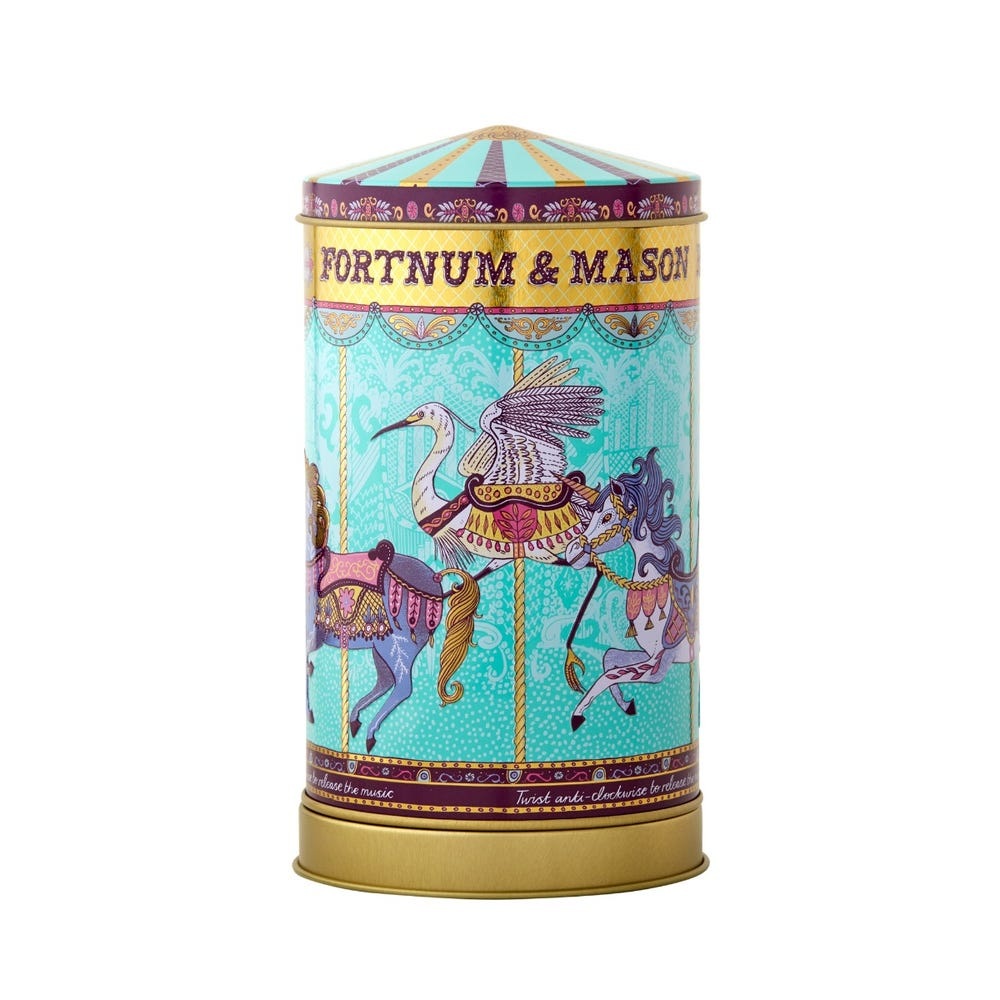
I enjoy being able to work on a complete variety of things but I still get a thrill when I see the biscuit tin for Fortnum and Mason that I produced the illustration for, art directed by Design Bridge. It’s always exciting to see your work on a physical product whether that is a book cover, or packaging…and when it is food related, all the more exciting as you get to eat what is inside too! 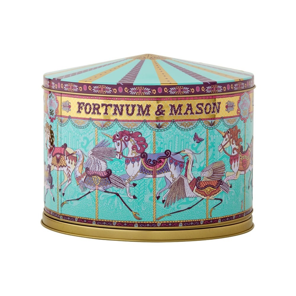
3. What role does craft play in your work?
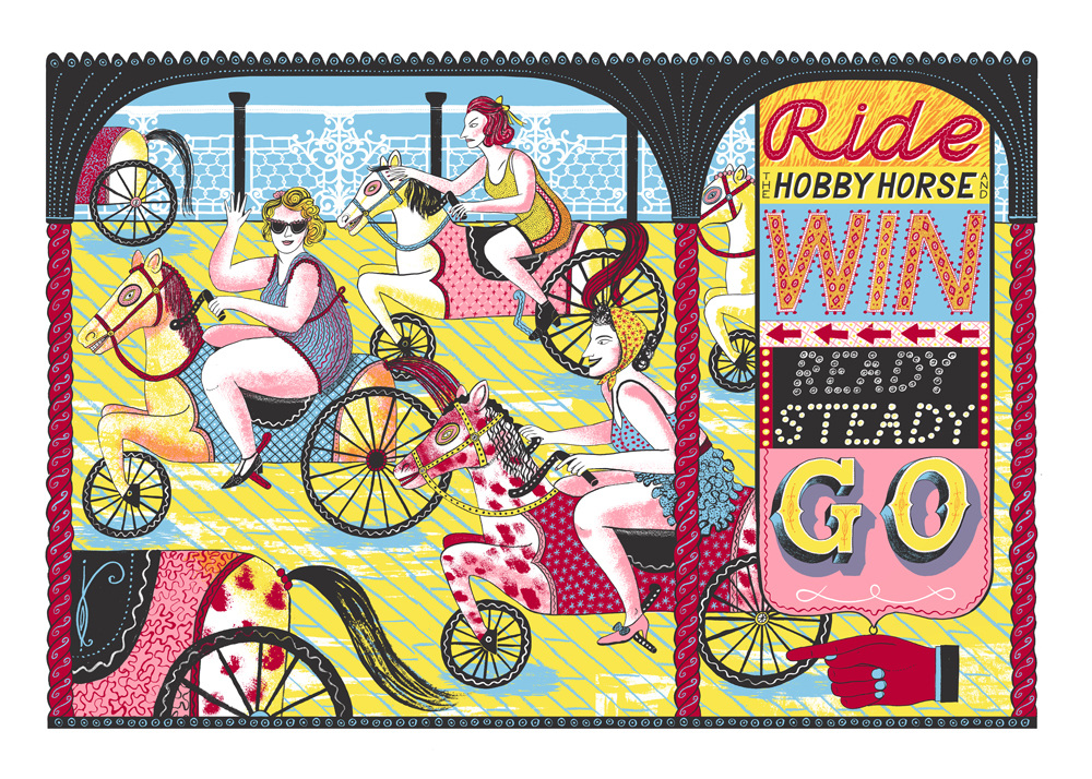
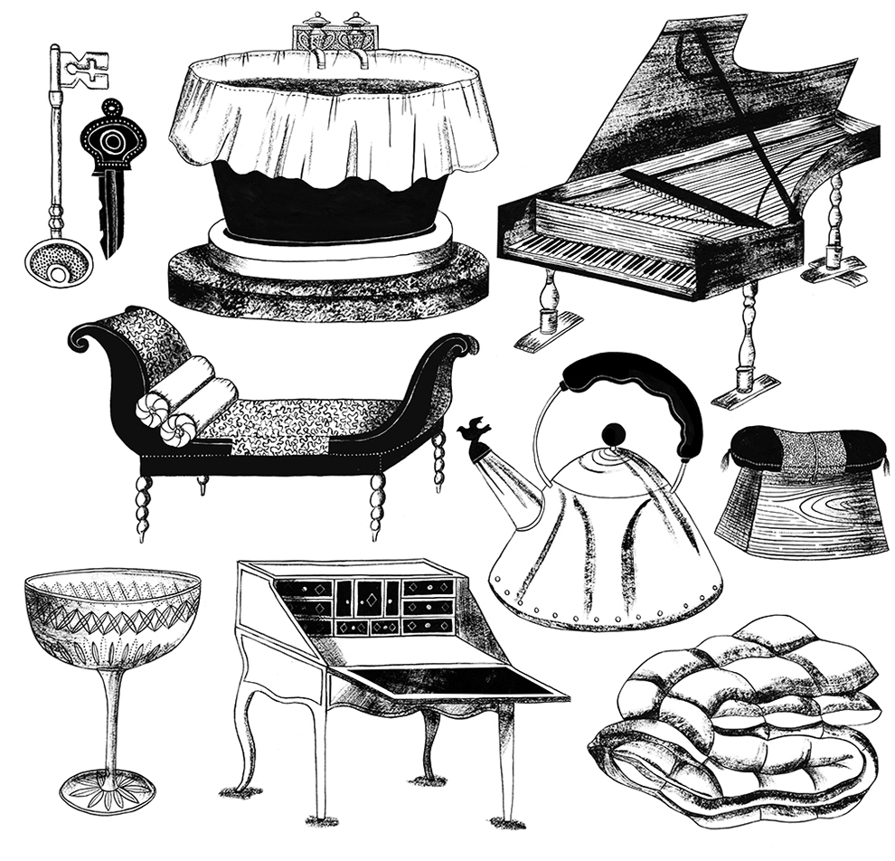
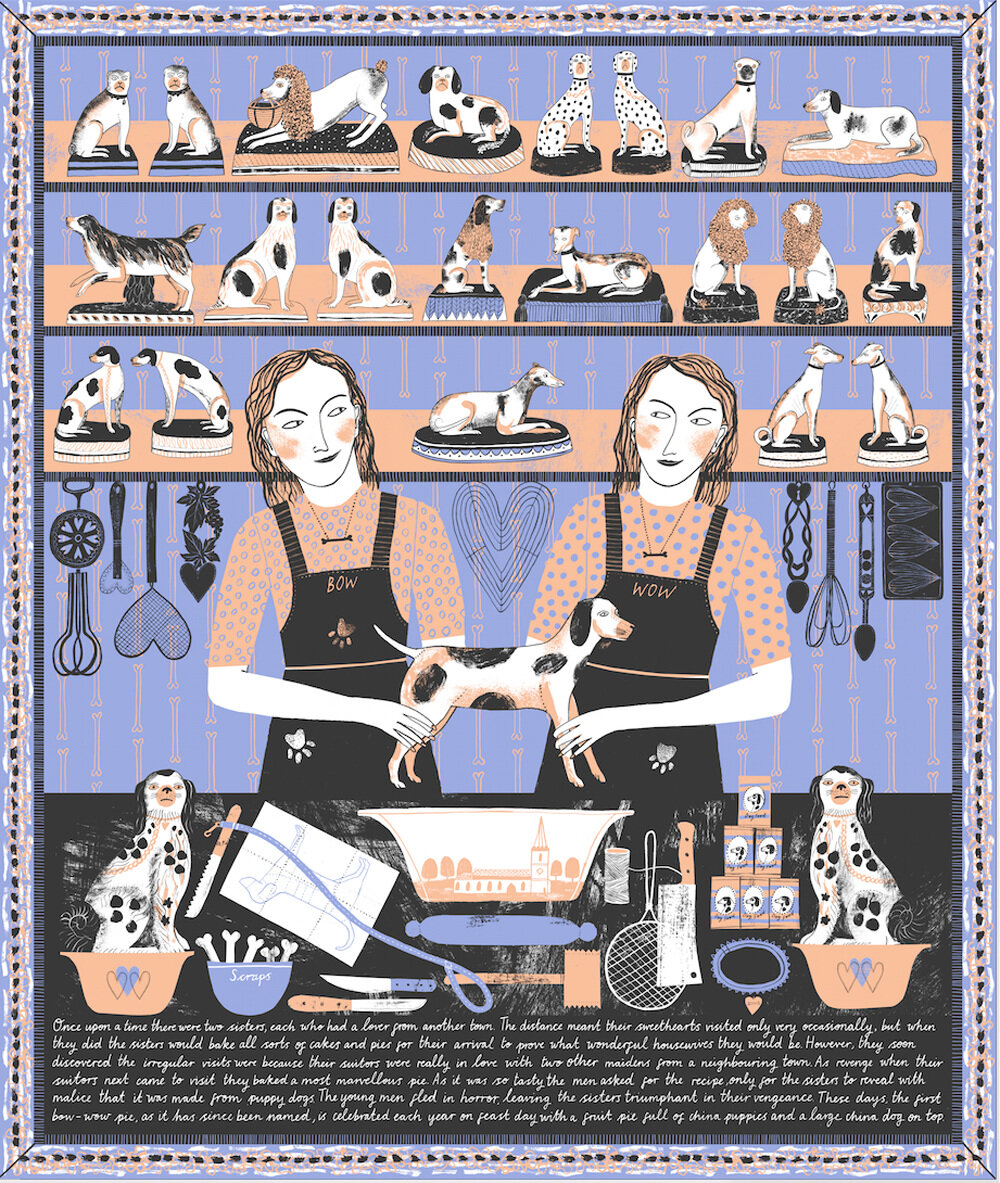
All my work still begins by hand so in that sense craft is at the heart of it. I do my drawings with brush and Indian ink and also paint textures and marks which I then cut and collage in. Sometimes I use a more traditional paper cutting style for just silhouettes. Within my personal work, I usually develop my images into screen prints which I produce with The Print Block, a collaboration that has been going for almost ten years.
4. What is your current workspace like?
Very very hot! I work in a shared studio in Hackney Wick with two other illustrators Nanna Koekoek and Jan Bielecki. It’s quite an unexciting space really, but I love it and being able to have somewhere to go to and (just as importantly!) leave behind at the end of the day. My workspace comprises of my computer, scanner and Lightbox at one end, which realistically is where I spend most of my time on commissions and then I’ve split my desk space so I’ve got a little bit more room where I draw in sketchbooks. I’ve got a cork board above my desk with some images that have caught my eye, and also a proof of a print I did of my parents allotment which makes me think of home. Then books, prints, old notebooks and sketchbooks are in a big mess piled on shelves behind us! 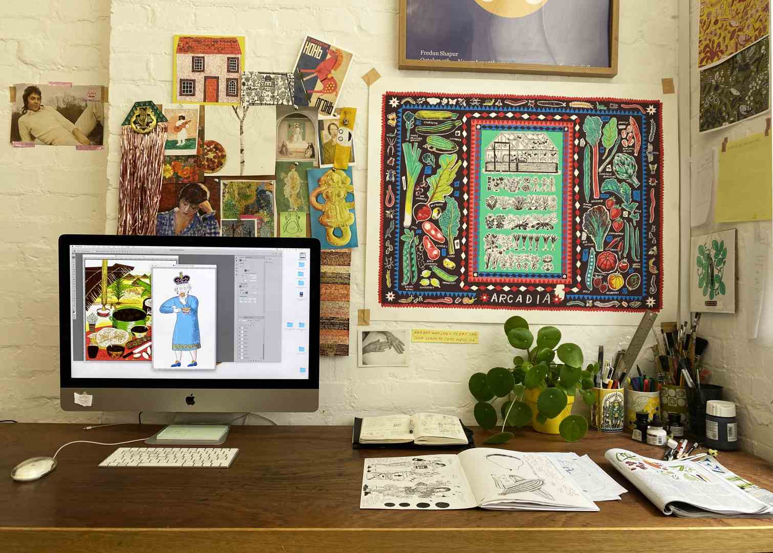
5. What is the best and worst thing about being a freelance illustrator and why?
I guess the flexibility. It works both ways. I love the flexibility in the sense that if I decide on a Tuesday afternoon I want to go to an exhibition I can; I’m not tied to the office (unless I have a deadline on Wednesday morning!). And also I get to work on lots of different projects. But then the other side to that is that you don’t have a consistent working day or week. You don’t necessarily know when your next job is coming. I’m fortunate in that I have a few regular magazine commissions which keep me rolling and then work on bigger or longer projects as and when they come.

6. Where do you find inspiration for your work? Who influences you?
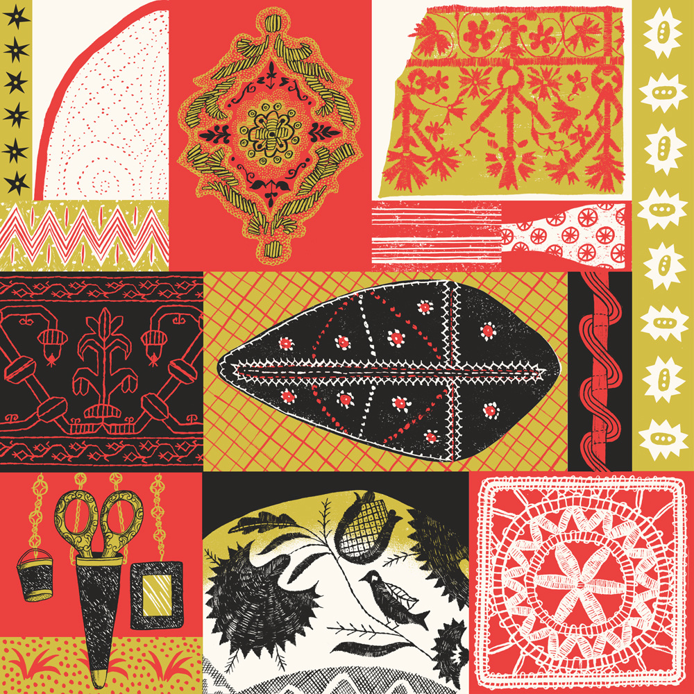
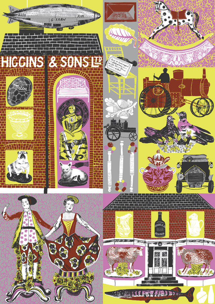
For my own work I look at lots of historical references for inspiration, often textiles, ceramics, packaging, ephemera… I love American folk art quilts, and rugs and English embroidery and china. I love the V&A museum collections, particularly the British galleries and the really tall shelving in the ceramics galleries. I also accumulate books of a variety of topics that I regularly refer back to. I’m a bit of a magpie, I gather sayings, rhymes, decorative patterns, motifs that I often incorporate into my work.
7. How did you develop your signature style? How does it differ to when you first started out?
I think this is where my style developed…wanting to include lots of different elements and references developed into a sort of ‘patchwork’/ ‘scrapbook’ feel with my own work. I think my work differs on a practical level from when I started out, in that I am much more decisive and efficient with my time now. When I first started out it could take me weeks and weeks to do an illustration that I could do in days now.
8. When is your favourite time of day to create?
I’m definitely a morning person, so getting up early and getting on with a project is when I’m most productive. Although a couple of years ago my New Years resolution to myself was to start the day by reading some of my book, which I love….so sometimes that slightly alters my routine depending on how engrossed in my novel I am! I find it really positive to start the day doing something just for my own enjoyment.
9. Do you have a dream project and or client that you’d love to work with?
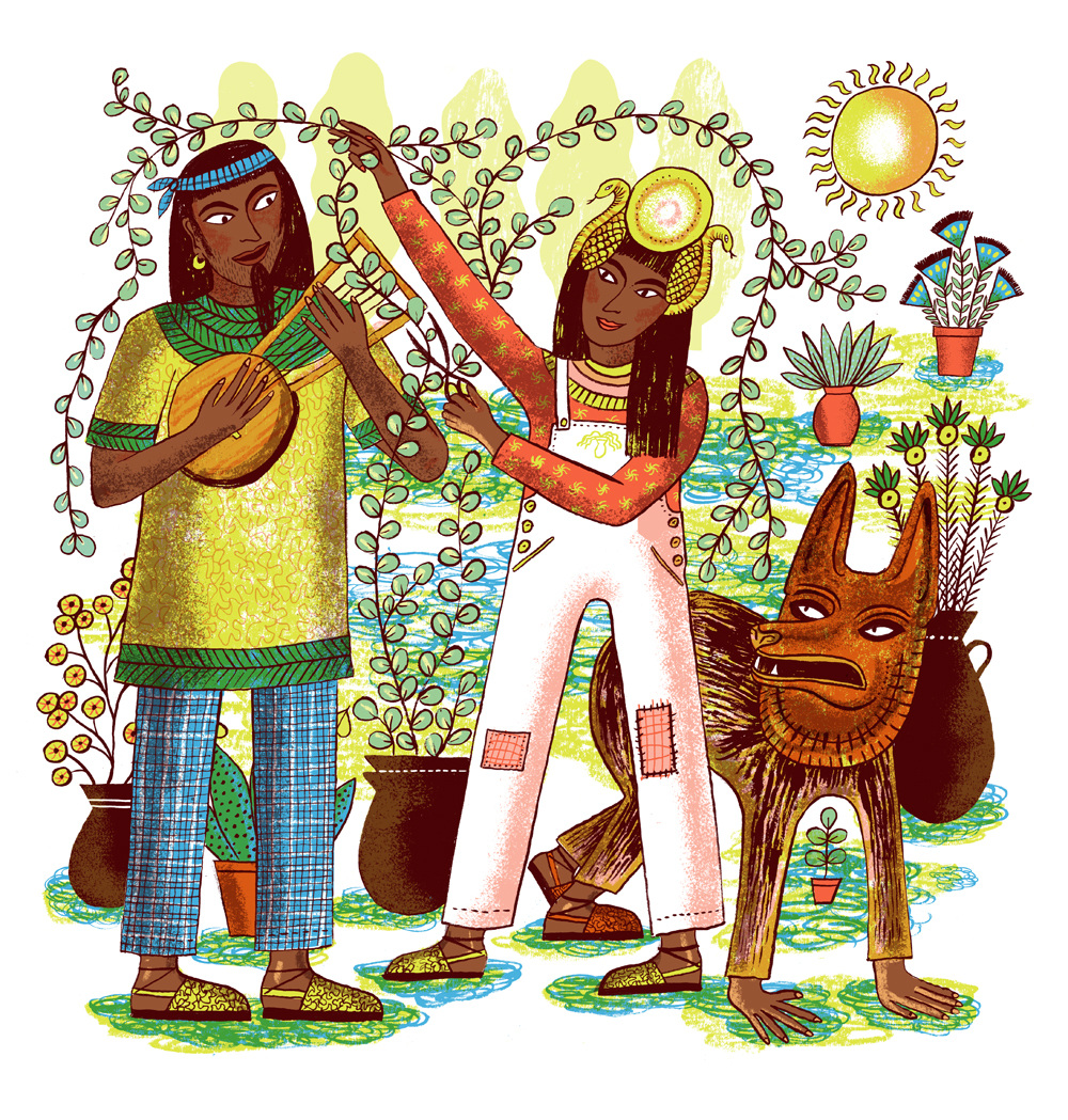
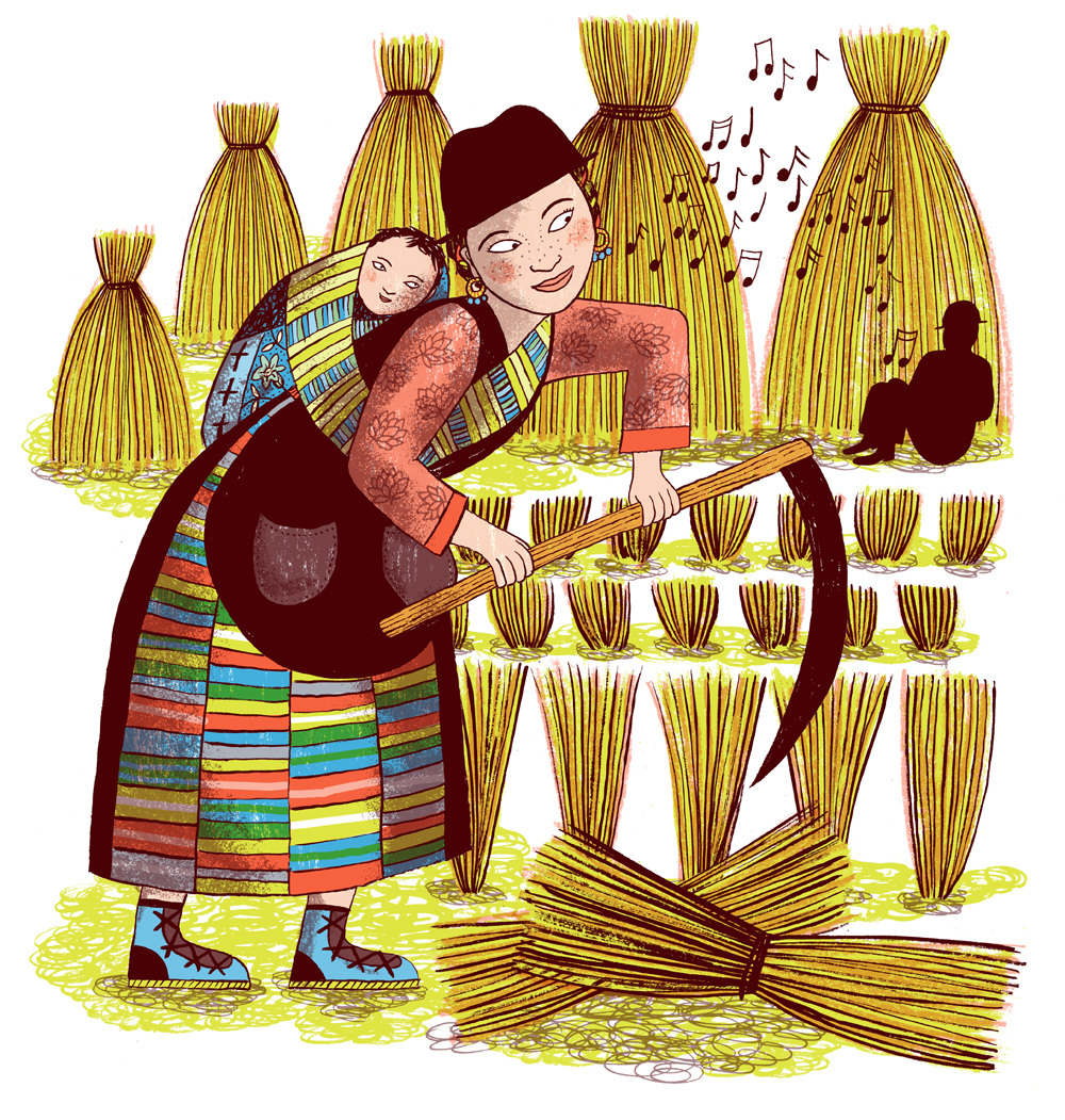
I’d love to work on more illustrations for (food) packaging or at least more food related projects! A bakery? A cook book would be lovely. Aside from illustration I love cooking and baking and reading about the history of food/recipes so that would be a nice meeting of interests. I spend far too much time thinking about what recipe my next meal is going to be so that would put that to productive use?!
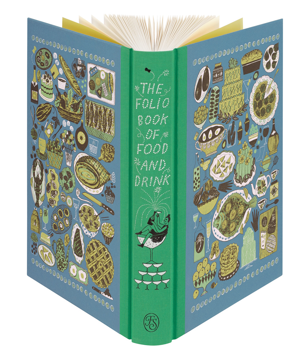
I’d also love to do more work directly in collaboration with a museum or gallery or private collector responding to their collections.
10. What do you wish you’d known when just starting out that you know now?
How to do my tax return.
11. Having worked on various projects from publishing to editorial to packaging for Fortnum and Mason - which has been your favourite avenue and why?
I’m not sure I have a favourite to be honest, as I said before I like having a variety of things to work on. I think if I was constantly only working in one avenue I’d get a bit bored! It’s quite useful to be able to chop and change between things when you need some space and perspective on one project. I do love working on the illustrations for packaging as I love seeing how the design teams I’m working with then translate it into a tangible object.
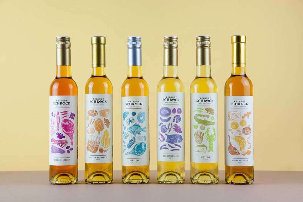
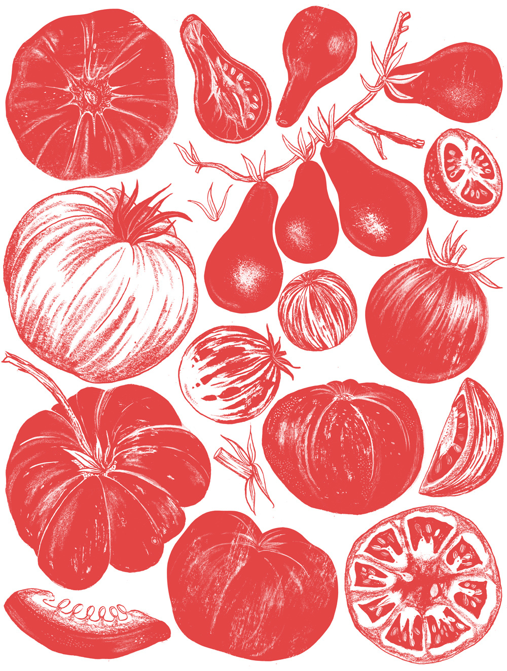
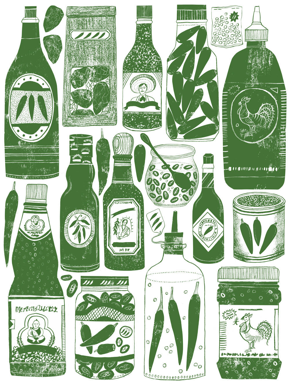
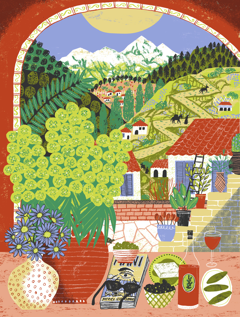
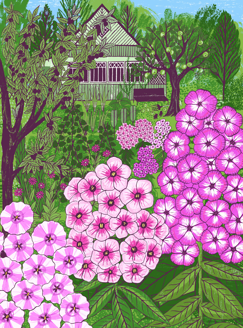
I also love working on book covers/ book jobs as I love books and reading so much. Lets be realistic, as illustrators/designers we definitely do judge a book by it’s cover! I really like working on spot illustrations of different objects - when I was doing the condiments labels for Fortnum and Mason it was like illustrating a shopping list which I love. And currently I do a regular illustration for Blanche Vaughan’s column in House and Garden which is like a seasonal ingredients list which is lovely - and working ahead of publication gets me excited about the produce coming up!
12. What message do you hope people take away from your work?
Inspiration to look, read and draw themselves.
13. As an artist what one thing couldn’t you live without?
My left hand!
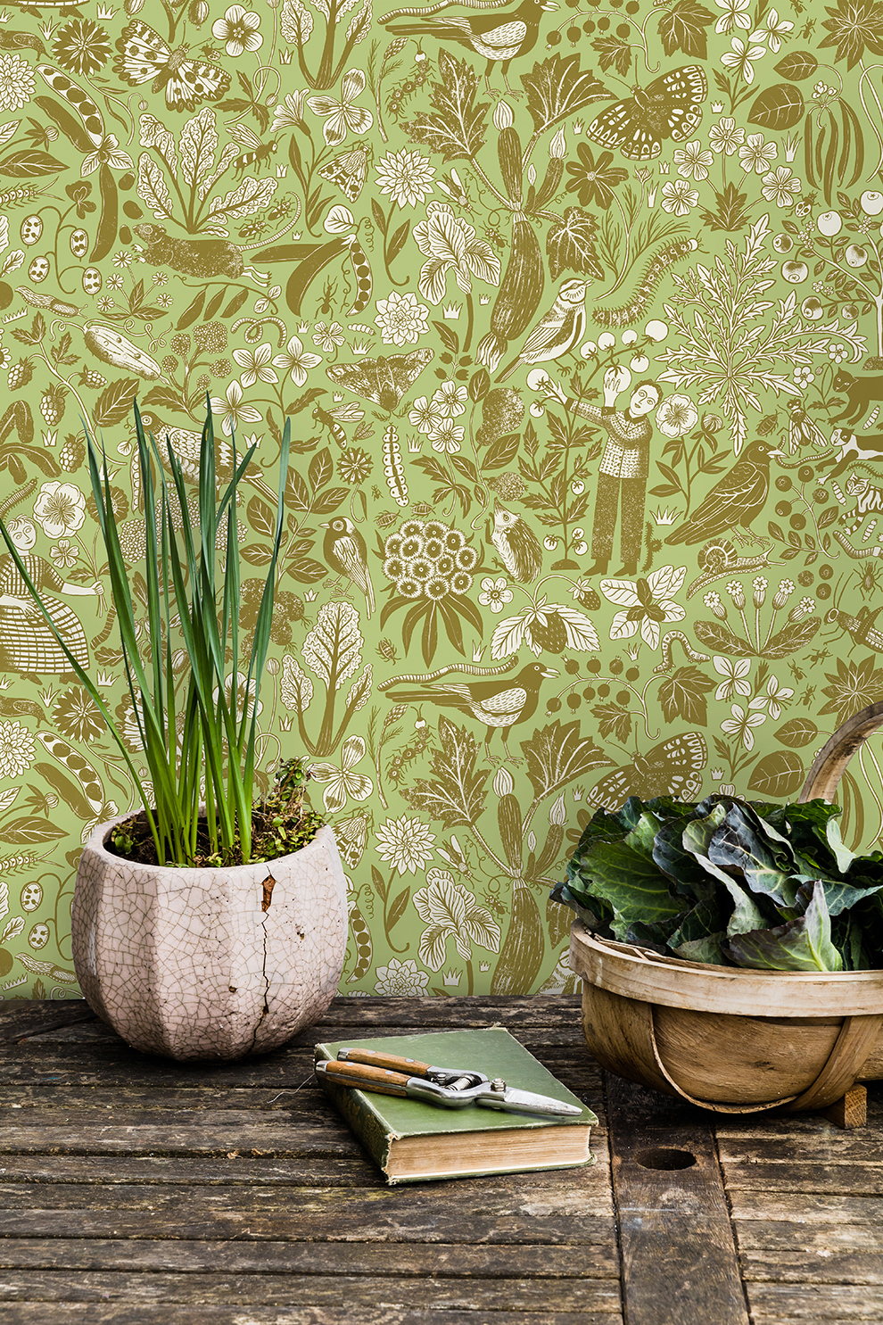
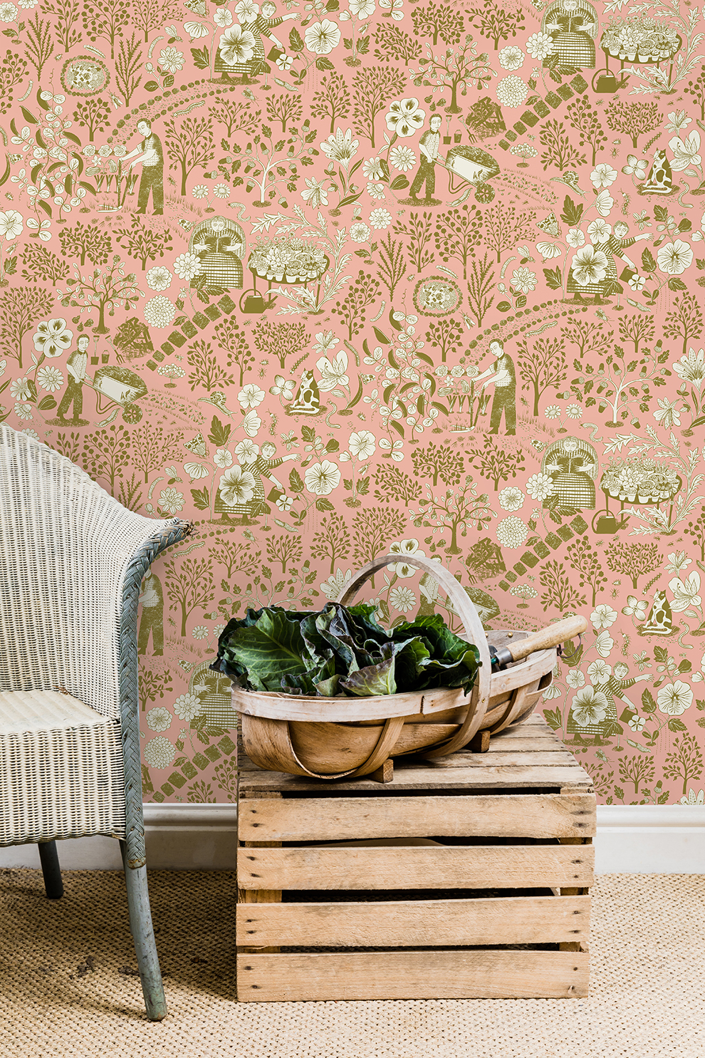
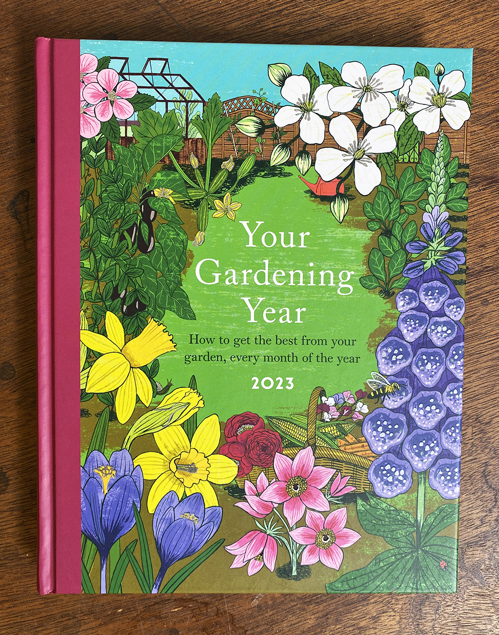
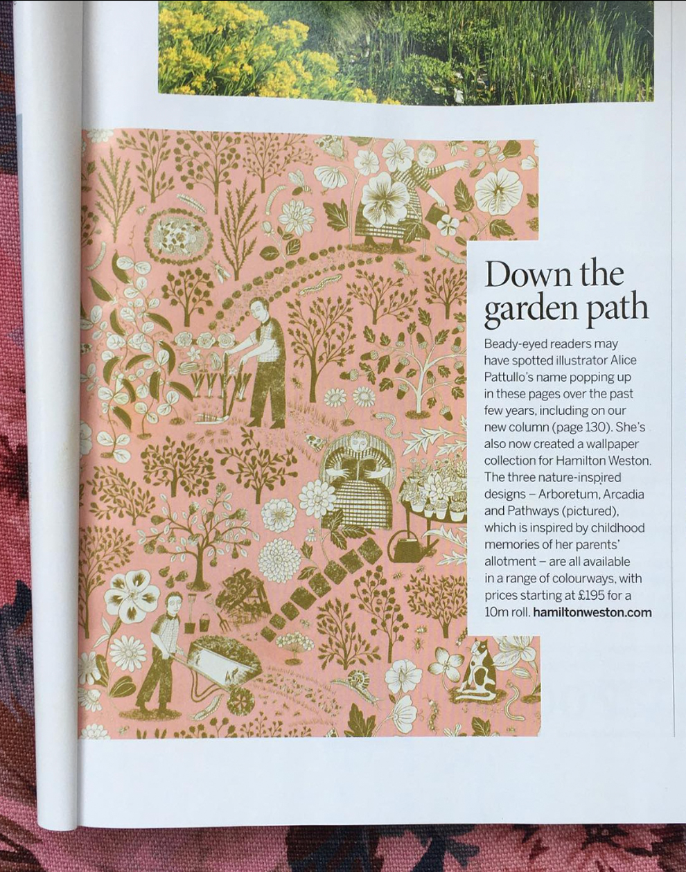
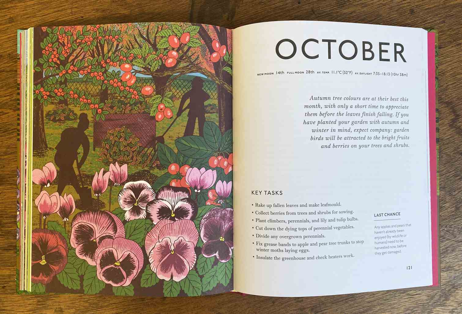
This October, Alice's nature-inspired designs hit the pages of Garden Illustrated, as well as featuring in the book 'Your Garden Year 2023'. Comprising of three wallpaper designs - Arcadia, Arboretum and Pathways - each pays homage to childhood memories of her parent's allotment, and the homegrown fruit and vegetables that are illustrated throughout.
14. You recently designed a three-part wallpaper collection for Hamilton Weston Wallpapers. What makes them unique to you?
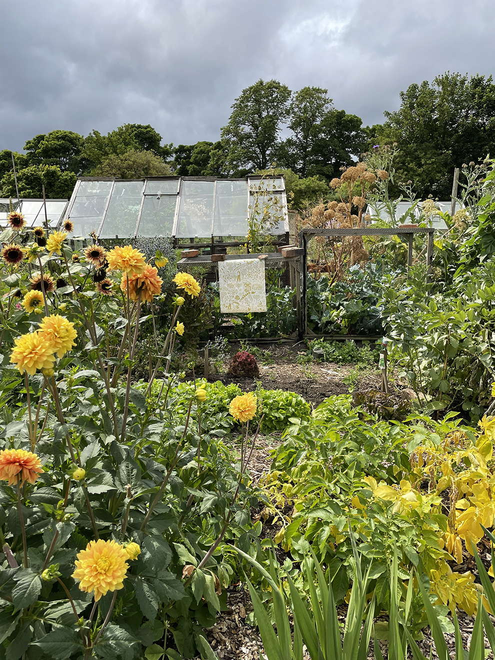
My Arcadia collection takes inspiration from my parent's much-loved allotment in the North East. They have had the allotment since my mum was pregnant with me (so 35 years!), and being brought up in a Victorian terrace with only a backyard, it very much became our garden away from home. Having lived in London without a garden, I began to feel nostalgic for home and the allotment. It now feels like an urban idyll; my very own Arcadia when I get to go back to visit.
Lots of the produce they grow has made it into the designs ‘Arcadia’ and ‘pathways’ which are a direct inspiration from the allotment; tomatoes, purple sprouting broccoli, cavolo nero, gooseberries, raspberries, courgettes, the table of alpines, broad beans, the little apple tree, mange tout, the giant cardoon plant, my mum picking her beautiful dahlias and zinnias, my dad trimming the path edges, our childhood cats that were buried there, and all the creepy crawlies that come with gardening!
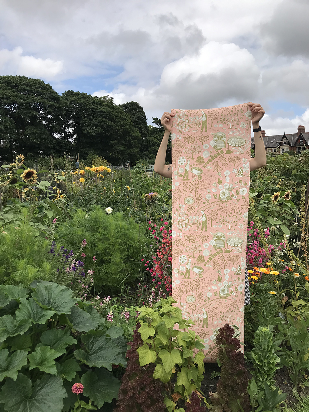
'Sowing and setting’ and ‘arboretum’ are a broader celebration of nature, gardening, and tending to and harvesting. Arboretum manifested itself after spending many months marching the tree-lined streets and parks of London during the pandemic, watching the trees grow and change.
I took visual inspiration from Stumpwork embroidery as well as traditional scherenschnitte (paper cut) designs when creating my own. I love the abundance of the old English stump work embroideries, the animals and insects always seem to outsize the people and dwarf the plants. Being very much of the more is more school of thought, using paper cutting for some of my work forces me to simplify (a bit!) my images and physically makes me look at them from a different perspective. I can hold them in my hand and move them around to make the finished compositions.
15. Where would it be if you could have the wallpaper anywhere in your house?
Small spaces look great wallpapered - bathrooms, under-the-stairs toilets, hallways…. places where you end up quite close to the walls and can see the details! I think the Arcadia designs would be lovely in a garden room, or sunroom that looked out onto a garden.
With research at the heart of her practice, Alice's playful works are crammed with decorative detail and authentic heritage. Check out Alice's folio now!


News


